On the day of filming we decided to change our idea completely due to issues with too many groups wanting to use the same location. Instead we decided to use the graveyeard as the setting for our film. Our aim was to create a flux in the audiences mind with regard to the outcome and message contained in the film. We did this by focusing the camera zoom on a specific name on a gravestone. Our actress(MG) was then filmed facing the name on the gravestone. As the frame panned round to the actress it showed the name on here file contained mwithin her bag, the same name as was on the gravestone. The actress then walks away slowly and somberly. This films causes the audience to be unsure as to whether the character visiting the gravestone is the ghost of the buried or a younger relative with the same name, and contributes successfully to the eerie feel we aimed to create.
I feel that this short film project was successful, bearing in mind that it was a first attempt. We achieved our goal in terms of what type of mood and thoughts we wanted to plant in the audiences minds. One small think i would change given a larger budget was a more intricate support system for the camera as the shot slightly shaky using a tripod without moving support.
Friday, 19 November 2010
Thursday, 18 November 2010
One Shot film:Week 1
For our first short, one shot film we were required to go to the Aboretum Park to find inspiration. Towards the top there was a tunnel which we decided to use as the setting for our short film.
As we only have a group of 4 to work with, we have decided to only use 2 actors, Emile and MG, with Rob as director and myself as the camera man. We aim to create a sense of horror with the help of lighting, or lack of lighting. To create suspense we plan to focus the camera on the the MGs feet(the victim), rather than her whole body to start with, as she is walking towards the camera and the tunnel; at the same time the audience will hear some strange noises coming from the other end of the tunnel. As she walks past the camera we plan to pan the fram out revealing the whole of MGs body and her potential attackerand source of the strange noises(Emile), hooded and shouded by darkness, at the other end of the tunnel. As MGs attacker begins to run towards her the camera will cut out leaving the audience wondering what will happen next.
As we only have a group of 4 to work with, we have decided to only use 2 actors, Emile and MG, with Rob as director and myself as the camera man. We aim to create a sense of horror with the help of lighting, or lack of lighting. To create suspense we plan to focus the camera on the the MGs feet(the victim), rather than her whole body to start with, as she is walking towards the camera and the tunnel; at the same time the audience will hear some strange noises coming from the other end of the tunnel. As she walks past the camera we plan to pan the fram out revealing the whole of MGs body and her potential attackerand source of the strange noises(Emile), hooded and shouded by darkness, at the other end of the tunnel. As MGs attacker begins to run towards her the camera will cut out leaving the audience wondering what will happen next.
Monday, 8 November 2010
Researching Ideas for my Ident
As we are already a week into our second module, animation, I thought i better start researching my ident. The brief states that my ident must represent my blog, twitter and Facebook all rolled into one. I have both Facebook and twitter account for me personally and for my website so I guess I'm going to have to choose which one I want to represent through my ident.
After looking at some other examples of idents I think I could more accurately portray the motives of my website through the use of animation. I started by looking at music channel idents like MTV as I believe this to be closest to the kind of ident I envisage using.

http://www.youtube.com/watch?v=tGzm9SeMPvY
These are all idents which I personally enjoy, however as I am creating an ident for my business it is essential for me to bear in mind the fact i need to create something which my audience will find enjoyable. The users on my site are predominantly male so my ident must be created with that in mind, however not exclusive to females either. The website does cater to all age groups, and this is reflected in the design of the logo, which uses mainly primary colours to reflect both the ambiguity of the target market and the quirky design nature I also incorporated in my site.

Clearly, I would intend to base my ident around the PartX logo. Despite doing this I don't want to copy the logo completely so i may change the design in terms of colour and perhaps font type so that it is more practical in an animated form.
Tuesday, 26 October 2010
Interactive Space:Design Process Part 2
I have posted all of my new photos now. As I said before the practicality of my initial idea inhibited the process considerably, hence the need for change. Something I did not mention before however was the feasibility of the story line within the desired context. The story simply did not make sense using different types of trainers. This initial idea would suggest the involvement of a range of characters throughout the interactive space thus creating a fundamental floor in the design process.
For my revised idea I have decided to focus on just the one character, ‘Harvey High Top’. I decided to use a name in order to personify the shoe and make it more involving and emotive, as my interactive space is aimed at a young audience, aged 6-10. I decided to fashion the piece for this demographic as children begin to read individual words at the age of 5 and by 6 they can start to read short, simple sentences. Although my narrative will probably prove too advanced for a 6 year old I would hope to challenge and encourage their reading skills, through the use of images so that they could follow the interactive space confidently by the age of 7 or 8. I decided to use my brightest pair of trainers as children tend to be more responsive to bright colours, this way I would hope to encourage their desire to read through visual engagement. I will use Photoshop to add in the narrative in a comic book style before linking the photographs using html.
The pictures took a very long time to take simply due to the range of locations I had to use to accommodate my storyline. I found myself walking long distances around the city in search of suitable backdrops for my photos. If I were to improve this I would use a white backdrop in a studio and bring my own props to the trainers in order to demonstrate the story. In doing this I would also be making the image, as a whole, cleaner and simpler to the eye; something which I prefer as a personal preference that would also be more suitable for children. Another problem was the way I portrayed the trainers and the practicality involved in this. With my initial images I used trainers on their own, not being worn by a person. I decided to change this to improve how realistic the images looked, however in doing this I was automatically presenting the need to incorporate someone else to help with taking the photographs. This became a problem, as I was not able to pay anyone to help take pictures I had to fit in around the schedules of friends, something which proved to be frustrating as I found it hard to coordinate my availability with theirs, this prolonged the photography process.
I am quite pleased with my photographs in that I believe they successfully show the story I had in my head, and, with narrative and editing this will be easily presented to the audience. Obviously I will not be using all of the photographs I took as this would make the interactive space far too long and tedious for children to remain engaged throughout. I intend to choose around 15 photographs to incorporate into my final interactive space.


Tuesday, 19 October 2010
Design Process Interactive Space
I struggled to come up with a good idea when trying to think up themes for the images to use for my interactive space. I was keen to create a story, but at the same time was aware of the constraints i would face having a small amount of frames with which to work with. My previous short shot sequences were on racing on cooking, two subjects which i did not find would be particularly entertaining fro my target audeince, children.
I knew that i wanted to base the images on something that i am intersted in and have a passion for however not directed at specifically entertaining my age demographic. This was when the idea of trainers came to mind. I am a bit of a trainer collecter so this is something i like but also something that can be personified in order to entertain children who are not interested in them from a fashion perspective.
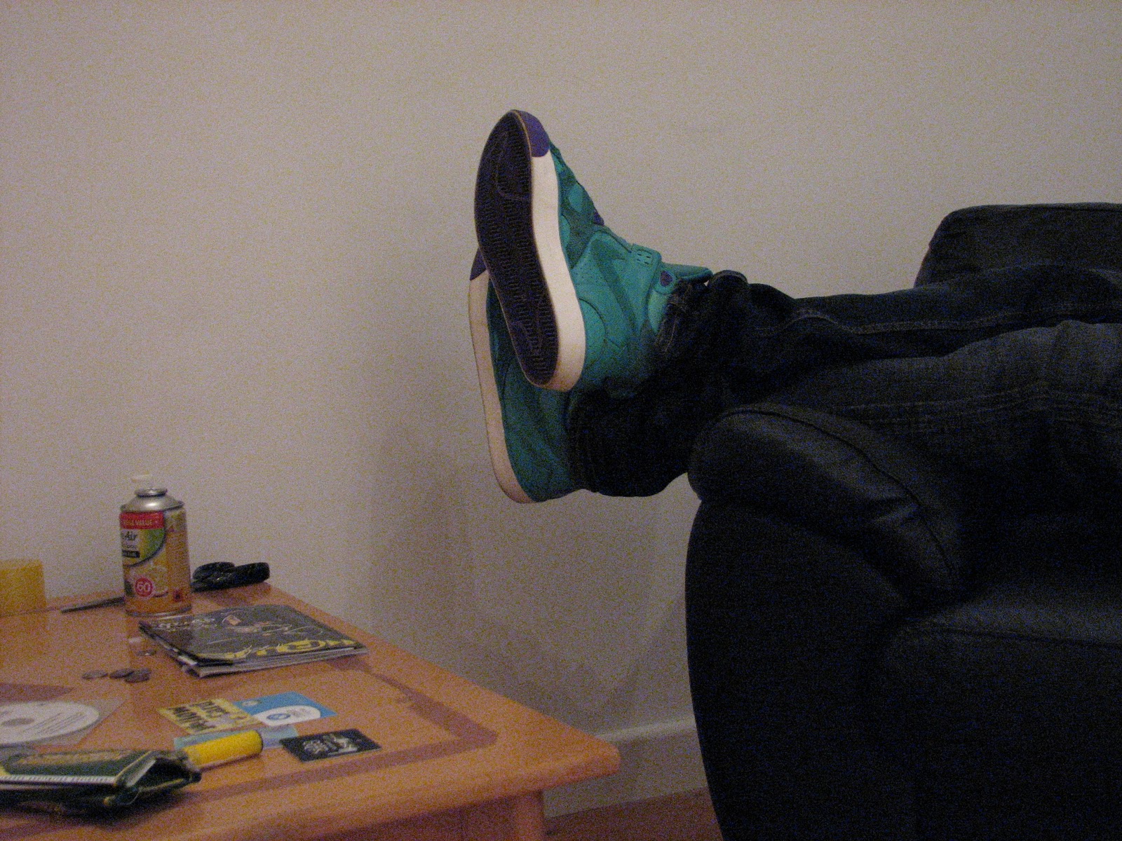
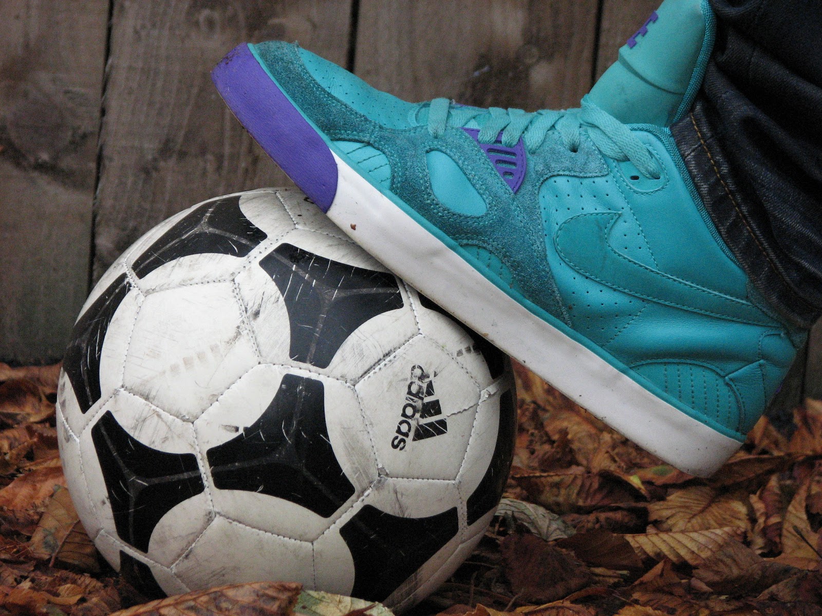
Initially, i came up with the idea of taking photos of different shoes partaking in a range of activities. After taking a few pictures like this i realised this was not such a practical idea as i would have to carry around lots of pairs of trainers to different locations in order to photograph them. The initial photographs i took are shown above, this was before i changed my idea slightly.
I knew that i wanted to base the images on something that i am intersted in and have a passion for however not directed at specifically entertaining my age demographic. This was when the idea of trainers came to mind. I am a bit of a trainer collecter so this is something i like but also something that can be personified in order to entertain children who are not interested in them from a fashion perspective.
Initially, i came up with the idea of taking photos of different shoes partaking in a range of activities. After taking a few pictures like this i realised this was not such a practical idea as i would have to carry around lots of pairs of trainers to different locations in order to photograph them. The initial photographs i took are shown above, this was before i changed my idea slightly.
Tuesday, 12 October 2010


My Design Process
PartX
 The rest of the site was just a case of combining usability with design, using the colours already included in the logo.
Sometime at the end 2009 when I was earning some extra money selling cars I noticed that I had a surprising amount of people who asked if I would take their cars in part-exchange for the one I was selling. As I advertised in autotrader I tended to browse the magazine regularly to see what other cars, similar to mine were worth, in order to price mine competitively. I noticed, in doing this, that a high percentage of the adverts were labelled ‘p/x considered’ meaning they were willing to take another car in part exchange for the one they had advertised.
On contemplating this prospect further I deduced that this was a far more financially practical approach for some individuals. At the time of this chain of thought the country was deep in recession and many were short of cash, those who weren’t being reluctant to use their cash for an unpredictable and sometimes volatile investment such as a second hand car. Therefore it made perfect sense for those selling their own car to make a straight swap, also involving a difference in financial value for another car. This way they could keep any cash they had saved in the hands of the banks or a more stable investment such as bonds. Those who did not have the capital to buy another car whilst keeping their own would also find this imperative if changing their current car.
This lead me to the idea of creating my own website specifically for part exchange, as, on scouring the internet for sites already offering this service, I noticed there was no one lese doing it. However I thought ‘why limit this to cars?’ I decided to include a wide range of item categories including jewellery, toys and gadgets, tickets, memorabilia, home and leisure and many more.
The next decision to make was from a design perspective, how the site would look. I wanted to use primary colours as I was targeting a mass market and wanted to be inclusive to everyone. I played around with drawing a few logos and eventually came up with something that looked like this

Thursday, 7 October 2010
My Sequences
When deciding upon which sequences to choose, I honestly did not know where to start. There were some obvious choices which sprung to mind immediately, however I wanted to think outside the box a bit more and perhaps create some which would require slightly more effort but be entirely original. This lead me to think of what was going on in Nottingham at the time of my assignment, I searched on the internet and came up with the idea to pay Nottingham Horse Racing track a visit.
I went with my flatmate, who is a horse racing fan, with the intention of depicting his experience at a day like this. Gambling is an integral part of racing so i wanted to represent this through my images. I began at the parade ring where the enthusiasts examine the horses intently for signs of anything that may cause them to win or lose the race. He then went to the bookmaking stand to place his bet on the horse he had picked on the basis of its recent form and condition. The next shot was not an obvious choice as one would assume that the winning horse would be shown in the centre of the shot. To show the speed of the horse I took the shot so it was just entering the frame as it crossed the finish line, leaving a lot of green space in front of the horse. The successful better then goes on to collect his winning for the final shot.
Unfortunately there are only so many hours in the day and taking multiple shots at the races was imperative as I wanted a variety to chose from and upload in time for my Thursday lecture. So after the races I cooked some dinner nd showed the process from different angles in the style i would imagine a step by step cooking guide to depict it.
My next sequence was less abstract and just showed different stages of breakfast being eaten.
Here is another interesting shot of the winning jockey William Buick, after the race, outside the Weighing Room.


Subscribe to:
Posts (Atom)